Soul Searching
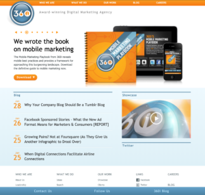
 The look and content of the company’s website no longer accurately reflected the organization. Some parts of the company were underrepresented or not represented at all. Increasing amounts of mobile traffic also necessitated the need to be mobile-friendly.
I asked the team to consider the true audience for this site and try distancing themselves as the audience. I spoke with the marketing team to discuss their goals for the redesign and consider what type of clients are our target. Working closely with marketing, we determined that the target audience is current and potential clients, with the secondary audience being career seekers.
Redesign Strategy
From the agency perspective, it’s an entirely different experience to work on a non-billable internal project. Especially one which conjures up so much emotion for people within the company. Input from each group, from SEO to Analytics, was extremely important. I interviewed team leads from each group to help populate the site content.
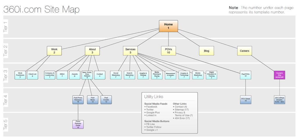
I structured the site map in a way that showed off the company’s capabilities. The design work is what draws the most attention and sets the company apart. Therefore that gets highest priority on the home page and top billing in the IA structure. While that’s an important aspect of how the company generates its profit, it is not actually the main source of income. That lies in the support services such as SEO and data science–decidedly less “sexy” work. I used the company’s design case studies as a way to bring attention to support services by using contextual links.
Future-Proof Design
I requested the site analytics for device traffic over the span of the prior couple years, which revealed a significant uptick in mobile traffic. Based on the findings, mobile-friendliness became a top priority. Up to this point, it was common practice to create separate sites for mobile and desktop traffic. But that meant maintaining two separate sites, which was very costly and inefficient. Enter in Responsive Design. This development technique was just emerging at the time of the site redesign. It was soon to become the industry standard, though it was far from that at the time. It was determined that this direction was worth the upfront effort and would likely save time and money in the long run.
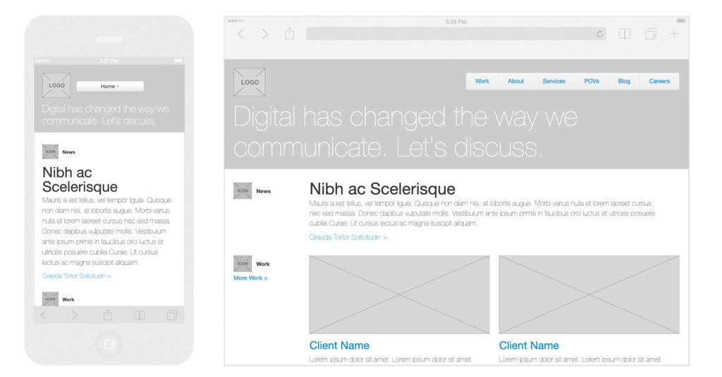
As the first responsive site design the company ever created, there were many unknowns as the team got started. Breakpoints, adjustable width columns, fluid images– all of this was unchartered territory. Getting buy-in from senior level management was also critical. To facilitate this, I decided to create a prototype. Using the bootstrap framework, I created live interactive wireframes which not only sold in the concept, but was invaluable in shaping the experience of the final product.
Development
I worked closely with the visual design leads while creating the wireframes. This way, I could ensure that there was consensus around workflow and interactions. I communicated the IA and content hierarchy to them and we worked together to ensure the look and feel supported that. We iterated many times on this to get the flow and tone just right. Working through the breakpoints was especially challenging. I did a lot of research on site traffic and screen size trends to set them appropriately.
Company Response & Future Iterations
There was much anticipation and excitement around the launch of this site. It helped to raise company morale and feedback was very positive from existing clients. It helped open doors for new client acquisitions and helped appeal to top talent. The Careers section was slated to be completely revamped for the next version of the site.
The site has since undergone several redesigns as new technology emerges and the market needs change. This initial responsive site is viewed as the one which paved the way for the current site structure.


